
Starbucks is the largest coffee house retailer in the world today, with over 15,000 stores in over 42 countries. With a Starbucks store at almost every corner, millions of people see the famous Starbucks logo every day.
The distinctive Starbucks logo has achieved broad visual recognition, equal in familiarity to the Starbucks brand name itself. At the same time, a certain mystique surrounds the trademarked image and the unusual mermaid like figure at the center of the logo. What exactly does the mythical looking figure symbolize or represent, and what does it have to do with coffee?
The original logo, conceived in 1971, was fashioned after a 15th century Norse woodcut, the image of a mythical two-tailed mermaid siren. The siren, as you may recall from Greek mythology, was an alluring and irresistible female figure, typically half-fish/half-women (the mermaid variety). The siren's objective was to a seduce the seagoing mariner with a powerful enticing song most often to the unfortunate demise of the susceptible sailor who could not resist temptation.
![]()
With a coffee brown color scheme, the circular ring surrounding the mythological mermaid figure contained the text "Starbucks - Coffee - Tea - Spices". The overall image was designed to resemble a cigar band label.
The symbolism of the mermaid siren was not intended to suggest the demise of the customers who bought the coffee, but rather, to represent the irresistible and seductive quality of the coffee itself.
Over the last thirty five years, the logo has undergone several significant changes, while still adhering to the original theme.
The original version remained in use until 1987 when Howard Schultz raised sufficient capital from local investors to purchase Starbucks from the founders for 3.7 million.
Schultz had previously left Starbucks in 1985 to pursue his vision of a European style espresso cafe when he started the Il Giornale coffee house. The Il Giornale logo reflected a theme of speed with the head of Mercury, the swift messenger god of Roman mythology, at the center. The theme of swift speed fit well with espresso. Espresso translates to a "fast and express" coffee in Italian.
After the purchase of Starbucks in 1987, the Starbucks logo was cleaned up a bit, a little more befitting of a new corporate image. The bare breasts were covered up by the mermaids flowing hair, although her belly button was still visible. And the color scheme was changed from a coffee brown in the original logo to the familiar green established by the Il Giornale logo. The text in the surrounding circular band was changed to simply "Starbucks Coffee".
![]()
Second Starbucks logo, 1987 to 1992
A third revision of the Starbucks logo in 1992 crops the image of the mermaid with a close-up view. Her navel is no longer visible. The mermaid's tails on either side are mostly obscured which creates some mystery and question for those not familiar with the earlier logo.
![]()
Current Starbucks logo
Recently, with the April 2008 introduction of the new Pike Place Roast blend, Starbucks has re-introduced a version of the original logo. While this is not a replacement for the current Starbucks logo, you'ill find this retro-logo on the Pike Place Roast cups, and Pike Place Roast bags of coffee beans.
This new logo version is similar to the cigar motif of the original logo from the 1970’s with a few differences. The phrase around the perimeter of the old logo was “Starbucks - Coffee - Tea - Spices”. The new logo retains the familiar “Starbucks - Fresh Roasted Coffee”. And the bare breasts in the original mermaid image are not covered with her flowing locks of hair.
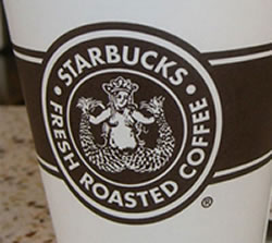
New Pike Place Roast Logo - Retro 1970
The marketing objective in bringing back this version of the original logo compliments the campaign slogan "Roasting coffee since 1971. The best cup then. The best cup now”.
Acknowledgement to the DeadProgrammers Blog for the excellent Starbucks logo detective work, and to Brand Autopsy's The Evolution of the Starbucks Logo for additional Starbucks logo research and reference to Howard Schultz's "Pour Your Heart Into It : How Starbucks Built a Company One Cup at a Time".
For additional background and interesting Starbucks History see Starbucks History - A Magnificent Tale of Innovation in the Coffee Industry